The Samsung Galaxy Note5 and Galaxy S6 edge+ Review
by Joshua Ho on October 2, 2015 8:00 AM ESTSoftware: TouchWiz UX and Edge UX
In the case of Android, one of the perennial debates has always been the role of the OEM in regards to software experience. There are some that advocate for OEMs to do the bare minimum, only providing the necessary drivers and other bring-up work to enable a Google/AOSP experience similar to what we see on Nexus devices. On the other end of the spectrum, there are some in the industry that advocate for the use of Android as a base, with significant work on the part of the OEM to introduce their own unique user experiences like MIUI. There’s a ton of room here for personal preference, so it’s necessary to try a UI before deciding that you’re going to be okay with using it for at least the next two years.
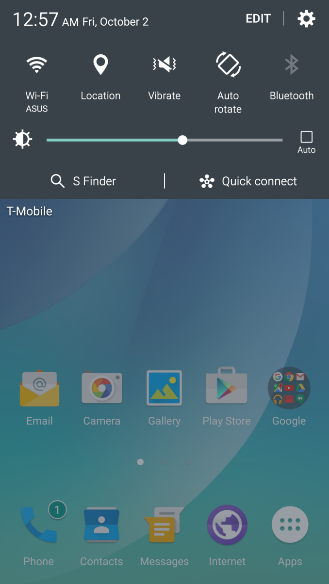
In the interest of full disclosure, I’m not particularly enamored by “pure” AOSP experiences. In general, I find that AOSP is lacking in a lot of ways when it comes to out of the box experience. There are quick settings, but there’s no way to add or remove toggles. There isn’t a particularly good weather clock widget for the homescreen, and the Google Camera application is light on features to say the least. Basic features like a battery percentage display in the status bar are also missing. While there are people that want to run custom ROMs to personalize all of these things, for most people I think some additions are helpful.
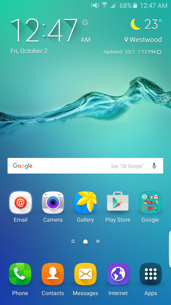
In the case of the Galaxy Note5, we’re looking at something that tends a bit closer to a full conversion UI like MIUI. Samsung’s TouchWiz has often received a great deal of criticism, but for better or worse with the Galaxy S5 and S6 Samsung has been toning things down to be closer to Android in terms of overall design and less emphasis on the longest feature list possible. For the Note and Edge lines, Samsung continues to add new features designed to enhance the usability of the stylus and edge display, respectively.
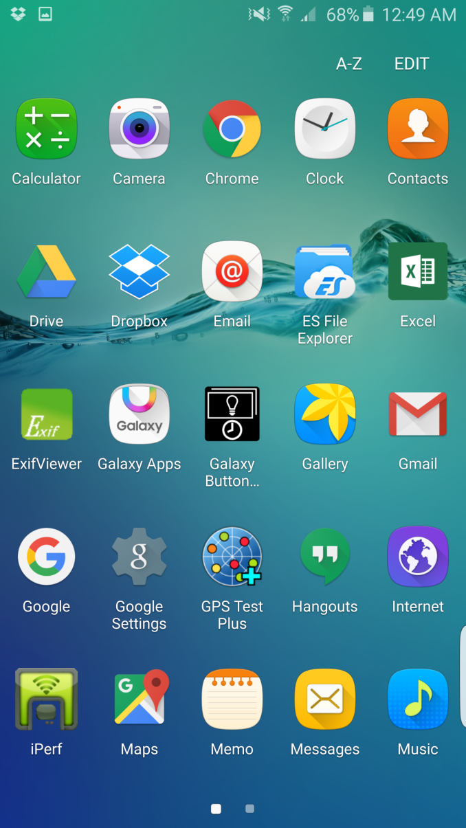
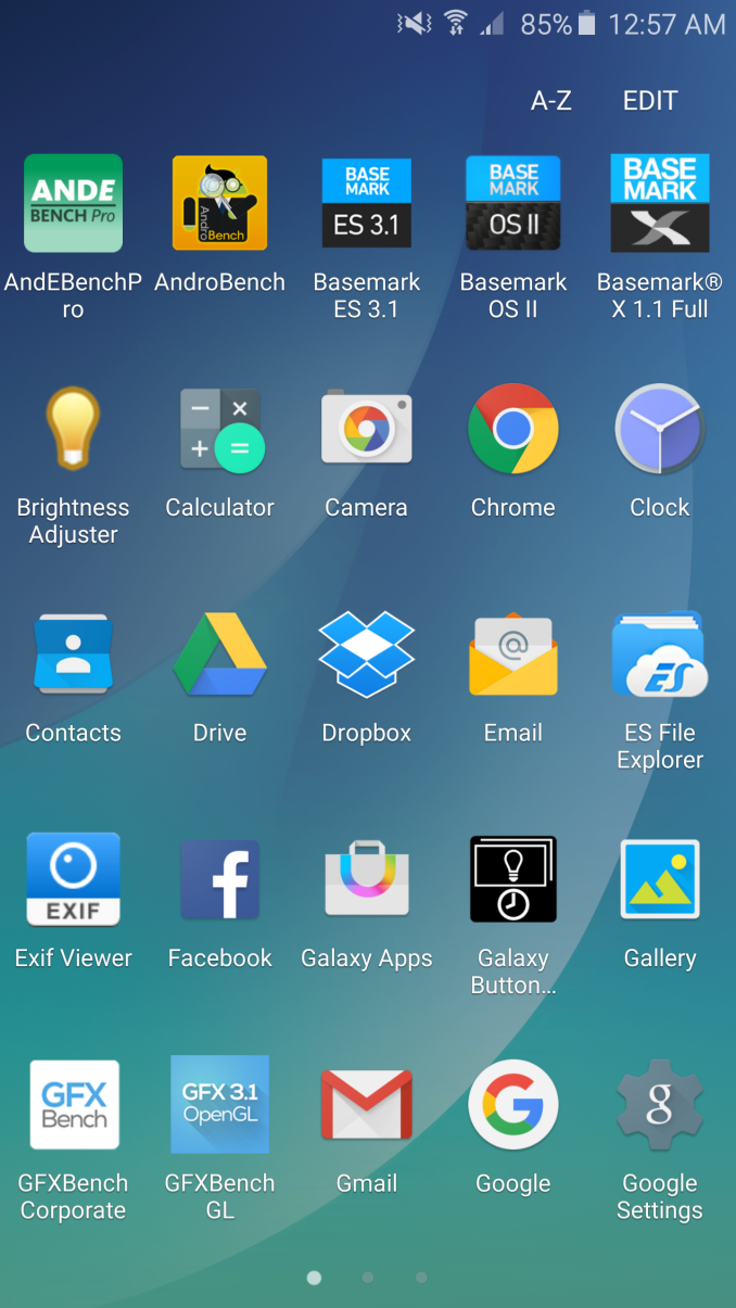
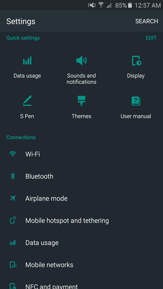
Other than these features, the Galaxy Note5 and Galaxy S6 edge+ have effectively the same UI as what we saw with the Galaxy S6, so those interested in a deeper look at the changes in TouchWiz for everyday use should take a look at the Galaxy S6 review to learn more. For the Galaxy Note5 and Galaxy S6 edge+, the only major changes from the Galaxy S6 are mostly in the form of a new set of icons. In practice, this isn’t really a change if you use a custom theme to try and clean up the aesthetic like any of the material design themes. The vast majority of the differences are centered on the new stylus functions and edge display functions, respectively.
In the case of the stylus functions, the Galaxy Note5 is a definite step up from the Galaxy Note 4. Samsung continues to be one of the few OEMs in the mobile sector to actually take styluses seriously, and it shows with the Note5. There is the problem of damaging the phone if you insert the stylus backwards, but the actual functionality that the stylus provides is excellent.
Although not really a part of the software, the pen itself is well designed so that the tip of the stylus has enough friction so handwriting feels natural. The latency isn’t quite at the level of pencil and paper, but lines track quite closely compared to older models like the Galaxy Note 3 or 4. Even at extreme angles the stylus tracks accurately and inking occurs exactly at the tip of the stylus where it touches the display rather than where the point of the stylus nub is. The pressure sensitivity curve is definitely fine-grained, but I feel like where the lightest possible pressure starts and where the heaviest pressure ends isn’t quite right. If I lightly graze the screen with the stylus, inking doesn’t really work unless I put some downward force to compress the tip. At the high end, it feels a bit like the force needed might be a bit excessive as any normal pencil would have a broken lead if I applied as much pressure as I did with the S-Pen to get to the highest pressure level.
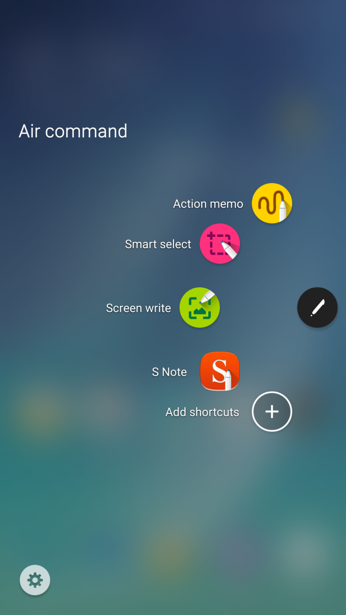
The software aspect of the Note5 is also very well executed for the stylus functionality. When you first take out the stylus with the display on, there’s nothing that immediately launches on the display which helps to reduce clutter. The Air Command display only opens up if you press the side button the stylus, which opens up Air Command. By default, you get shortcuts to pretty much anything you’ll ever use with the stylus, but there’s an option to add more shortcuts if you install extra applications that take advantage of the S-Pen. If you close the menu the Air Command button will remain in a translucent icon overlaid on the display, but it doesn’t react to any touches unless you use the S-Pen and can be removed by long-pressing the button with the S-Pen and dragging it to the top edge of the display. I personally ended up turning this feature off though, as I found it easier to just always press the side button to open up the stylus shortcut menu.
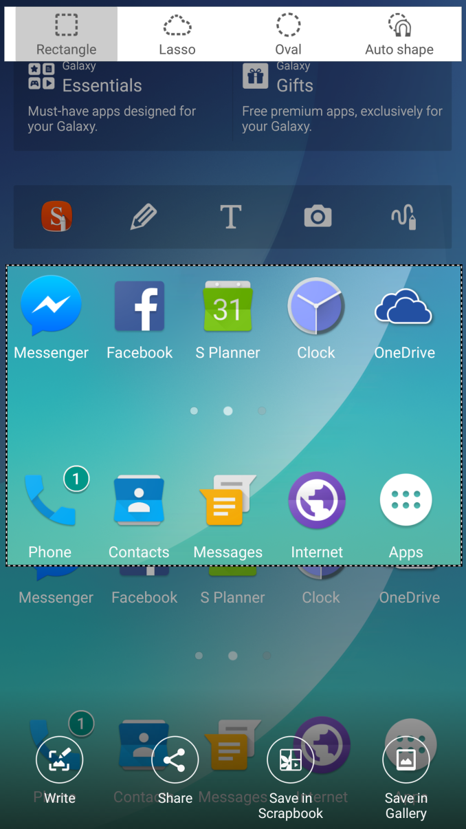
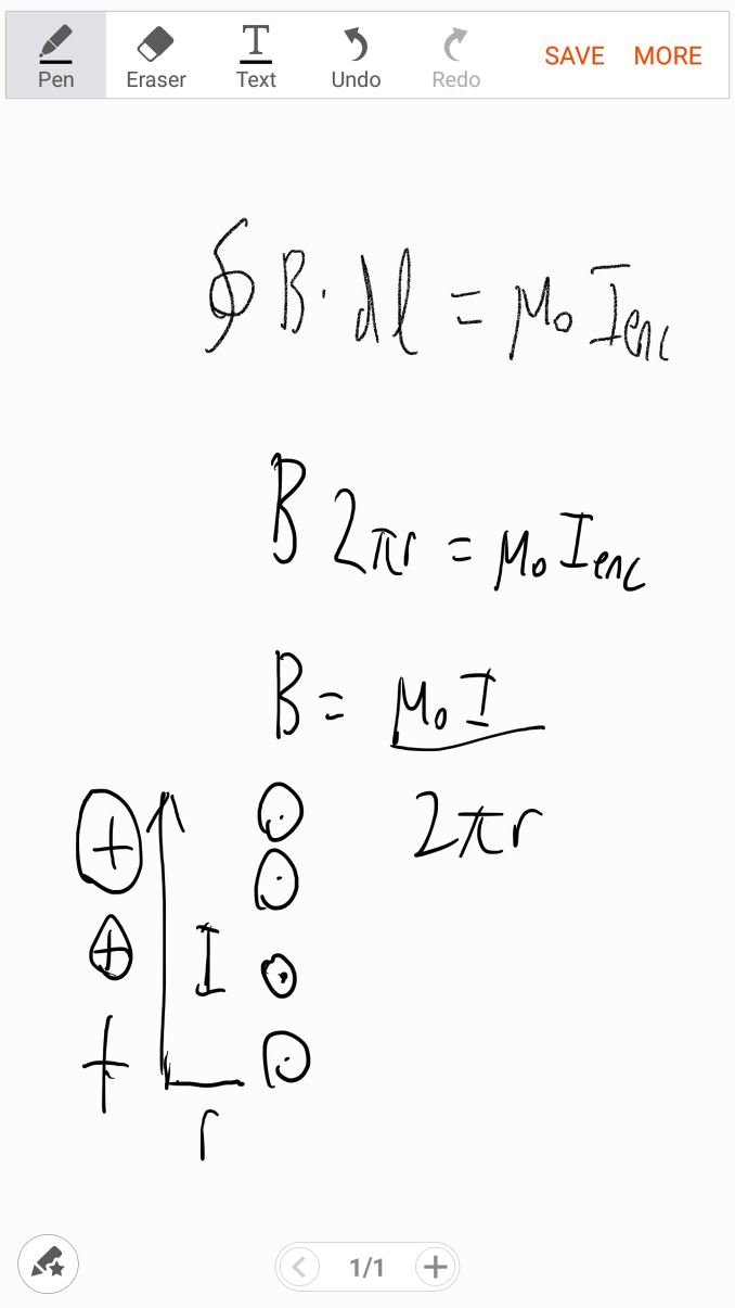
With the Note5, the default applications that support the S-Pen remain. You get Action Memo, S-Note, Smart Select, and Screen Write. Action Memo and S-Note are similar, but Action Memo is more of a quick notepad rather than the full-featured notebook application that is S-Note. Screen Write allows you to directly annotate a screenshot with the stylus, and Smart Select allows you to only screenshot a part of the display that is selected with the stylus.
These apps aren’t new, but they come with new features. For example, the Note5 adds the ability to use Action Memo with the screen off is and it’s quite helpful for writing things down in the moment. Scroll capture is a part of the Screen Write functionality and is similarly useful, but I continue to question why Scroll Capture is embedded into this application instead of being integrated into the native screenshot function.
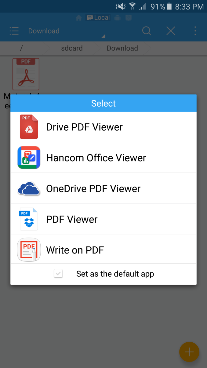
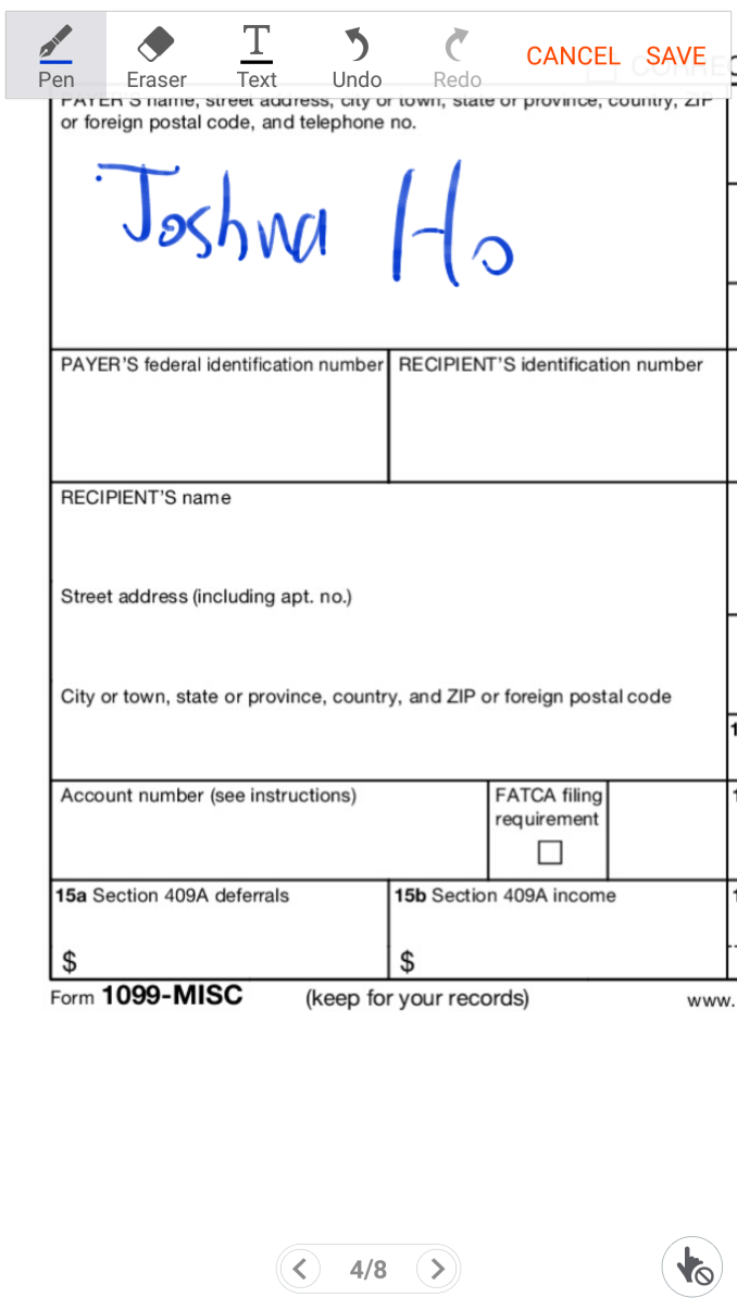
The final new feature for the stylus is PDF annotation, which is actually quite useful if you’re doing something like signing a contract in PDF form when the agreement requires a signature. More than once, I’ve had to actually print out the document and sign my name, then scan the document before sending the completed document back which is a pretty absurd waste of paper and ink.
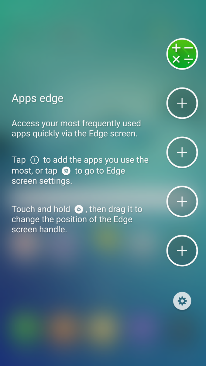
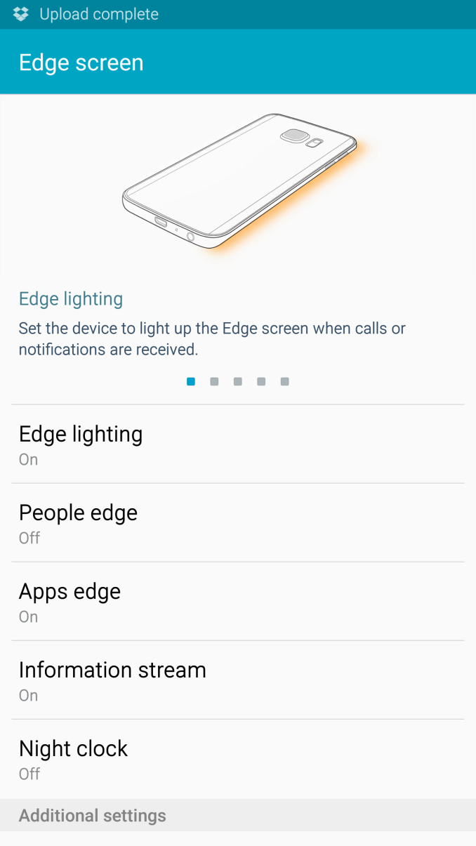
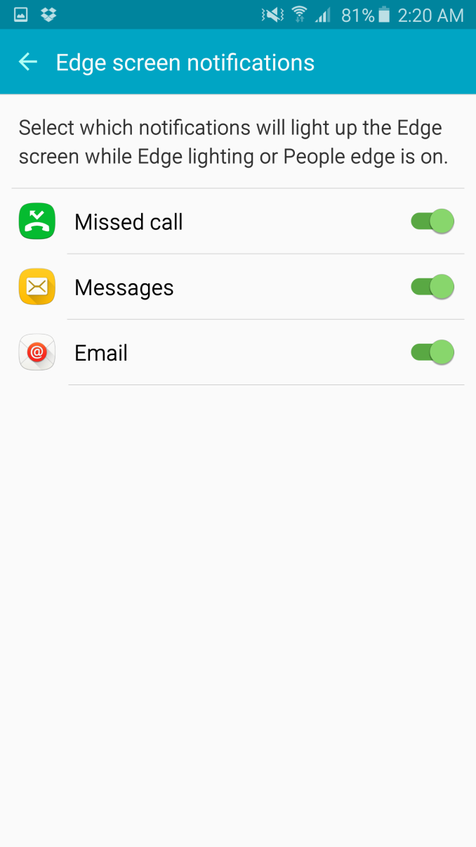
The Galaxy S6 edge+ has none of these features, dropping the stylus in favor of the edge display. In practice, there are a few applications that exist for this display. When the display is off and the phone is flipped over, the edge will light up when calls or notifications come in. If a call is coming in and the phone is in this state, you can reject the call by holding your finger over the heart rate monitor. The color can also be set to change depending upon whether a call or text message is coming from a specific contact. The edge display can also be used as a night clock, showing the time and date along the edge of the display. It’s also possible to view some quick information along the edge of the display by swiping along the edge of the display to view some news headlines, the time, date, and weather. The final feature of the edge display is that you can swipe in on the edge of the display to open an app drawer or a quick contacts drawer.
For the most part, all of these features are forgettable. There just wasn’t any good reason to use any of these features. The edge display is a cool piece of technology, but the practical applications are almost nonexistent at this point in time compared to the stylus, which has very obvious and clearly valuable use cases by comparison. I’m trying to keep an open mind about this, but I strongly feel that the edge display is solely an aesthetic change rather than a functional one. The odd touchscreen behavior around the edge makes edge swipes difficult as well, which is also a poor user experience in my experience as Android heavily relies on edge swipes throughout applications.
Overall, TouchWiz continues to be a decent Android skin, but at its core isn’t necessarily a selling point for Samsung phones. In the past we saw that TouchWiz was amazingly performant, but in my experience the Note5 and Galaxy S6 lack a certain level of smoothness. I don’t know how to really quantify this, but using something like a Nexus 5 and comparing it to the Note5 back to back the Nexus 5 has a tendency to feel quicker and smoother for whatever reason. The stylus features of the Note5 are a selling point though, to the extent that it could make the Note5 the only option if you absolutely need a phablet with a stylus. The edge features are unfortunately not nearly as compelling, and the experience is pretty much identical to the Galaxy S6.









225 Comments
View All Comments
kspirit - Friday, October 2, 2015 - link
Display and battery numbers, etc are on par with the iPhone 6 which is a year old now. The 6S looks like it'll wreck this thing.RMSe17 - Friday, October 2, 2015 - link
Except for the GFX battery, judging by how quickly the 6 ran out.kaidenshi - Sunday, October 4, 2015 - link
Maybe I just don't use my phone enough, but typically at the end of the day I still have around 40-50% battery life on my iPhone 6. My previous device was a Moto G, which was supposedly great with battery life but it would die on me around dinner time even on a light use day.Of course, I'm actually getting work done during the day instead of screwing around on Facebook or Bejeweled clones for 8+ hours at work, so there's that.
LoganPowell - Friday, November 27, 2015 - link
Both phones are good. But between the two, the Galaxy S6 Edge is way better receiving a higher review (see http://www.consumerrunner.com/top-10-best-phones/ for instance...) than S5.farhadd - Monday, October 5, 2015 - link
The reason the iphone 6 runs down fast is because it doesn't throttle the frame rate. It doesn't have to throttle because the metal enclosure can dissipate the heat efficiently enough to keep up.Oyeve - Friday, October 2, 2015 - link
Isnt the display on the 6 and 6s basically the same?close - Friday, October 2, 2015 - link
iPhone 6s has basically the same battery lifetime in real life experience because the battery is a bit smaller. So I really think "wreck" is a way to strong word.tipoo - Friday, October 2, 2015 - link
The 6S has nearly identical display and battery properties (slightly worse) as the 6...?kspirit - Friday, October 2, 2015 - link
It has presumably has a very fast chipset and storage though. Let's see how the camera stacks up to this, as well. I love how they designed the Note 5 but I'm so hesitant to go back to Samsung software after reading all those threads about people running into issues, on reddit :(abrogan - Friday, October 2, 2015 - link
In my family, 2 S4's died quickly after being purchased. My brother has a perfect Note 4, but my neighbor's sister bought an S6. Even after a fresh reformat, it always has the "google play services has stopped responding" error. No way to fix as far as I can tell... it's useless for her, and all the money wasted... My Nexus never has any software bugs, so I'm sticking with Nexus myself. I've had 3 perfect Nexus phones, so I'll buy another Nexus. Not very scientific, but....