Original Link: https://www.anandtech.com/show/6392/the-windows-rt-review
The Windows RT Review
by Vivek Gowri & Anand Lal Shimpi on October 25, 2012 12:00 PM EST- Posted in
- Operating Systems
- Microsoft
- Mobile
- Windows 8
- Tablets
- Windows RT
Meet Windows RT
Microsoft’s first serious foray into tablets came just after the turn of the new millenium, with Bill Gates demonstrating the first tablet PC prototype onstage at Comdex in the autumn of 2000. From there, OEMs started releasing tablets based on Windows XP Tablet PC Edition in 2002, with a full range of pen-enabled slates and convertibles releasing over the next few years. In addition to oftentimes prohibitive cost, each had its own set of drawbacks. Convertibles tended to be quite bulky compared to their notebook counterparts (the ThinkPad X-series being a notable exception), while slates were rather difficult to use - a symptom of shoehorning a desktop operating system into a purely touch-centric form factor.
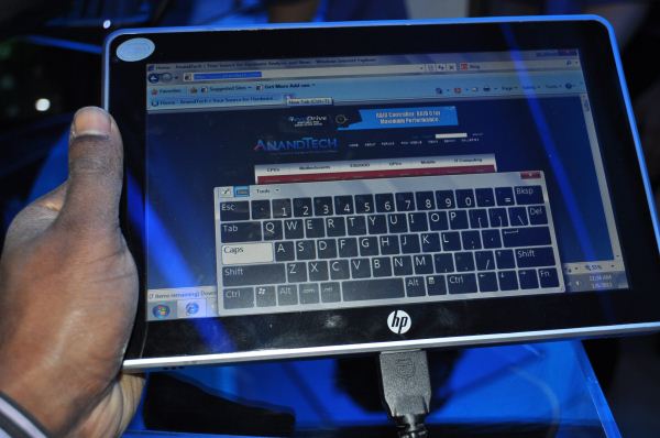
Fast forward a decade, to the beginning of 2010. After a number of conceptual non-starters in the tablet PC space - building tablet PC support into all editions of Windows Vista and 7 (other than Basic/Home Starter), the entire Origami class of devices - Microsoft’s touchscreen devices were floundering. The iPad had been announced to mixed reaction but an extremely high level of anticipation. Microsoft and HP countered with the Slate 500, an Atom-based device shown off at CES 2010 with solid state storage and Windows 7 in roughly the same form factor as Apple’s iPhone OS-based ARM tablet. With speculation pointing to a pricetag of just $549, the Slate appeared to be the most viable hope Microsoft had in trying to make mainstream headway with the tablet PC concept. But shortly after the iPad shipped in April 2010, rumors of the Slate’s demise started to circulate, and after a six month delay, the Slate 500 started shipping as an enterprise-only product in December of that year for $799. HP’s acquisition of Palm (RIP) definitely played a role in the sidelining of the Slate, but more importantly, it essentially spelled the end for the tablet PC. This was news that was perhaps known already, but the Slate saga officially pulled the plug on Microsoft’s original idea of what a tablet was.
The problem was two parts software, one part hardware. Microsoft had developed a very interesting touch-oriented user interface for its handhelds, so at least one part of the equation was relatively straightforward. The hardware issue came down to this: the iOS and Android tablets succeeding in the market ran off ARM system-on-chips, which resulted in slim, power-efficient tablets that had idle times stretching for days. At the time, there was just nothing in terms of x86 hardware that could compete with that in low-power device realm (Clover Trail and Haswell, of course, change this part of the story considerably). The other question? How to converge the touch-centric UI with the classic desktop environment that had been the corner of Windows dating all the way back to 95.
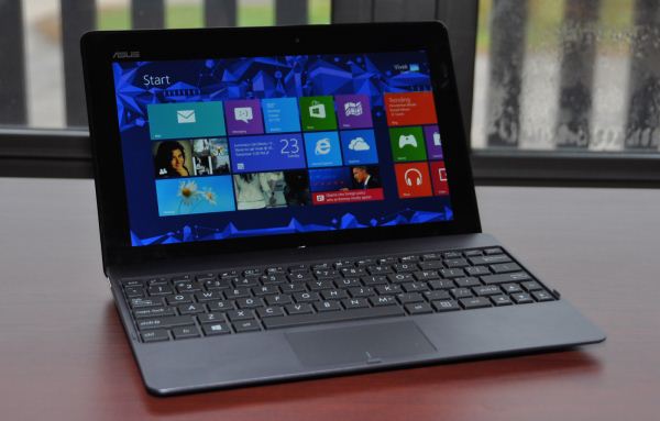
Meet Windows RT. It’s Microsoft’s first major foray into the modern tablet market, the shipping version of Windows-on-ARM, and it’s one of Microsoft’s most important product launches ever. Windows 8 shares the same touch-friendly user interface, but the ARM silicon makes RT an almost entirely tablet-centric operating system, the first for Microsoft. Combined with the focus on premium hardware experiences, this is Redmond’s most serious push to be competitive with the iOS and Androids of the world. How does it fare? Keep reading.
User Interface, Gestures, and Multitasking
by Anand Shimpi and Vivek Gowri
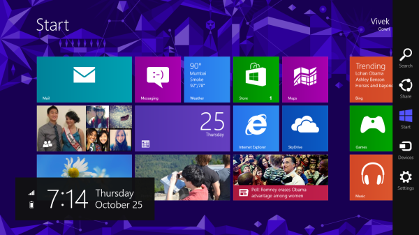
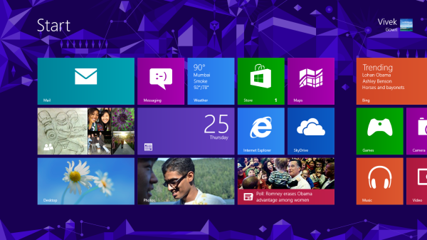
By now you should be fairly familiar with what Windows RT’s Start Screen looks like, at least from a distance. Power on a Windows RT tablet and you’ll be greeted by the new Windows UI. A big, horizontal canvas full of live tiles, a feature that first debuted in Windows Phone 7. Based on the Metro design language, and referred to as Metro UI for much of the development cycle, a trademark dispute has forced a name change to Modern UI. There’s no getting around it, there’s a definite learning curve to the interface. It doesn’t matter if you’re used to Windows 7, OS X, Android or iOS, the touch enabled Windows RT UI is going to feel different, and probably downright wrong...at first.
If you put in the time to learn and get used to the interface however, it is easily among the best tablet user interfaces I’ve ever tried. Everything we despise Windows 8 for on the desktop makes perfect sense when viewed through tablet colored glasses.
As a recap, Windows RT (and Windows 8) relies on edge swipe gestures for much of the macro control over navigation. Full screen apps are left purposefully barren, with their focus primarily on content. The power is in what lies (virtually) beyond the edges of the screen.
There’s no capacitive sensor array in the bezel of a Windows RT tablet, instead what the touch controller does is looks at starting position and velocity of gesture to determine whether your swipe originated on or off screen.
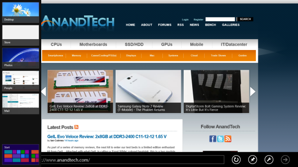
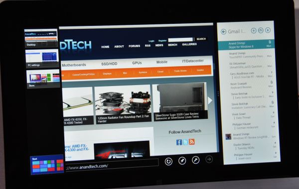
There are only four edge swipes you need to learn, one for each edge of the display. Swipe in from the left and you flip through apps, giving Microsoft the win for quickest task switcher among all tablets. By default a left edge swipe will switch to the previously used app, or if you just switched from that it’ll move to the next most-recently used app.
If you have a lot of apps to switch between simply left edge swipe in partially then swipe back out, revealing a more traditional task switcher (Windows + Tab also brings up this switcher). Of all of the Windows RT gestures the swipe in/out to bring up the task switcher is the most clunky, but it’s easy to get used to.
Go to the opposite side of the screen and right edge swipe in to reveal the charms bar. Here you get direct access to the software start button as well as a bunch of key tools, among them are search and settings.
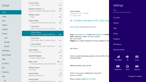
Although the appearance of the charms bar never changes, the function of these buttons do. Start always takes you to the start screen, but search and settings apply to the app currently in focus. I can’t stress how much of an advantage this is over iOS. If I need to play with an app setting on the iPad I either need to go home and to settings then find the app or hope the developer has stuck a tab somewhere in the app where I can play with options.
Even better is the fact that I can toggle things like an app’s ability to run in the background and whether or not it’s allowed to give me notifications on the lock screen directly from the app settings page. The icing on the cake? Playing with settings never forces me out of the app itself, Windows RT simply devotes the right 1/4 of the screen to settings, leaving my app still in focus on the left. It’s perfect.
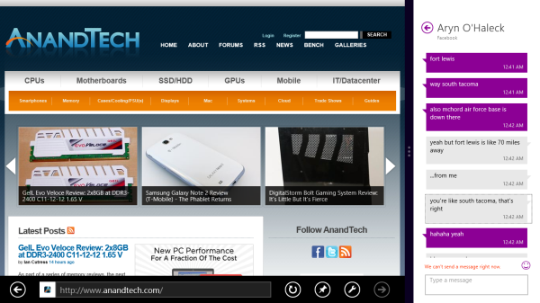
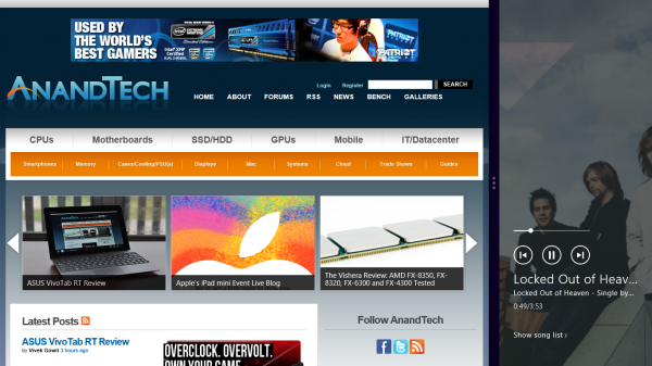
Also perfect? The ability to snap applications to the right or left edge of the screen and have a different window open in the remaining portion. This was called Metro Snap before use of the Metro name was discontinued, and it’s one of the more interesting features here. Snapping requires a screen with at least 1366 horizontal pixels, allocated as 1024 to the main window, 22 to the splitter, and 320 to the snapped application panel. It’s great for having an IM conversation or email inbox open on the side when writing, browsing, or doing essentially anything else.
One of the biggest issues I’ve had with tablet multitasking to date is that it’s all been very focused on the active window, which makes doing things like messaging an absolute pain because you’re continually flipping between whatever you were doing (let’s say browsing the web) and the messaging application. In Windows RT though, you just snap the conversation window to the side and continue browsing, just with a narrower browser window.
Messaging is just one usecase though - email, Facebook, Twitter, Skype video calls (their implementation is pretty cool - more on this later), music, a small browser window docked on the edge while writing in the main screen, the possibilities are endless. You could even theoretically turn it into three near-equal size windows using Aero Snap in Windows desktop, though that severely cuts down on usable space. But generally, the Snap feature gives the end user a lot of flexibility and makes multitasking a lot easier.
Top and bottom edge swipes end up being more application specific. Swipe up from the bottom and you usually get some additional options, while swiping down from the top edge is usually more of a navigational tool (e.g. showing multiple tabs in IE10).
Although Windows RT borrows from its iOS and Android brethren in that it will automatically pause and unload unused apps from memory, you can always manually move the process along by edge swiping down from the top and dragging the window off the bottom of the screen. This also works from the task switcher on the left side, drag over and down to the bottom of the screen to close. There’s some built in lag to ensure that you don’t accidentally quit something of importance but otherwise it works fine.
Overall, the edge swipe gestures take some getting used to but once you’ve made it over the hump they really unlock a totally new level of tablet usage.
I believe Microsoft is on to something real here with the new Windows UI for tablets. This new OS feels ahead of the curve on major issues like multitasking, task switching and displaying multiple apps on the screen at the same time. I was always told that marketshare is lost and gained in periods of transition. Microsoft missed the first major transition to new ARM based smartphones and tablets, but it’s perfectly positioned to ride the wave to notebook/tablet convergence. In fact, when it comes to figuring out how to merge those two platforms I don’t believe Apple or Google have a reasonable solution at this point. In Apple’s world the two are distinctly separate, while Google is arguably even worse off as it doesn’t have a good notebook OS at this point (the verdict is still out on Chrome OS, as promising as the new Samsung Chromebook appears to be). It’s unclear how big this convertible/hybrid market will grow, but I see real potential here. There are users who want an iPad and I don’t believe Microsoft does anything to change their minds. The iPad and iOS remain a very polished, very accessible platform that is really optimized for content consumption and light productivity. For anyone who wanted more however, there’s now an alternative: Windows RT.
Bridging the Gap, the Dichotomy of Windows RT
by Anand Shimpi
I described Windows RT as being a tablet OS with all of the underlying Windows-ness of Windows. You can get the big full screen app experience in tablet mode, but poke around your file system with Explorer or use Office 2013 like you would on a traditional notebook if you want to. If the two sides of Windows RT remained fairly separate that’d be one thing, unfortunately there are some dependencies between the two sides of the OS that keep the overall user experience from being as friendly as it is in iOS. There are still occasional reminders that you’re dealing with something that’s distinctly Windows here.
Most mobile OSes have done their best to hide the underlying file system and shell from the end user. Microsoft did, in my opinion, the smart thing and avoided hiding its roots with Windows RT. Although the new Start Screen is the default UI for Windows RT, there’s a big desktop tile front and center that will take you back to something far more familiar:
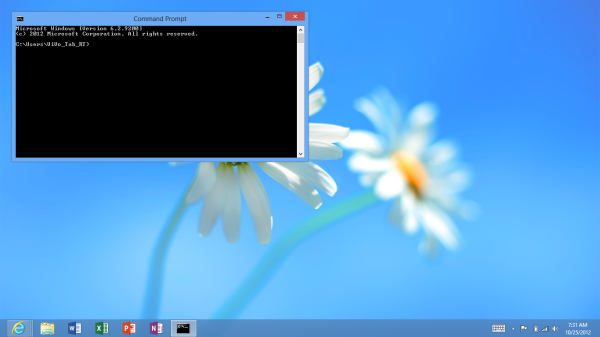
Unlike the Windows 8 desktop, you’re pretty limited in what you can do here. The only applications that are allowed to run in desktop mode under Windows RT are Explorer, IE10, Office 2013 and the command prompt (there are also all of the Windows specific tools and settings which I’ll get to shortly). Developers cannot make applications for Windows RT desktop mode and you can’t sideload anything here. Microsoft’s belief is that by completely locking down the system, requiring that applications only come from the Windows Store, it can avoid the pitfalls of viruses and malware that can plague Windows machines today.
Steve Sinofsky famously quoted an analyst when they asked if Windows RT would be backwards compatible with all of the legacy Windows viruses and spyware. The answer was an astounding no, and this is exactly why we can’t have open season on Windows RT desktop development. There’s also the obvious financial angle to all of this. Microsoft takes a cut of any apps sold through the Windows Store.
Coming from the perspective of a traditional Windows user, the lack of flexibility on the desktop seems wrong. From the perspective of the rest of the ARM based tablet space, it’s not a big deal. At least Windows RT gives you direct, first party access to the file system. There’s very little exposed through iOS, and with Android you need to download a third party app to get access to the file system.
Explorer works just as it would on a Windows 8 PC. The folder structure is exactly as you would expect it on any Windows machine. There are even some x86 remnants in the Windows RT install such as a C:\Windows\SysWOW64 directory complete with x86 binaries inside that obviously won’t run on your Windows RT tablet.
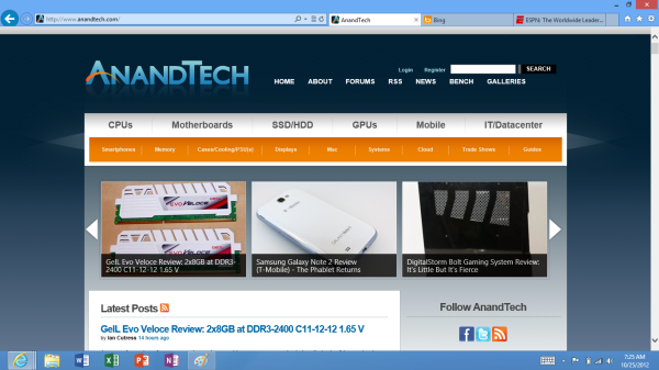
Internet Explorer in desktop mode works just like a traditional IE windows application would work. The desktop app actually controls settings and features for the Metro...err...fancy IE10. For example, if you want to change security settings, clear your history or empty your cache, you have to do all of these things from the IE10 desktop application. Fancy IE10 doesn’t expose them.
The command prompt is, well, a command prompt. It features all of the same commands that you could run before, although once again you can’t simply drop an x86 exe on your system and run it. Not having binary compatibility can be frustrating at times.
Although developers can’t build applications for Windows RT’s desktop, you can write and execute batch files. Keep in mind that if your batch file needs any additional support files (e.g. sleep.exe) you’ll need ARM versions of them which, unless they come from Microsoft, just isn’t happening.
As I mentioned earlier, there are a few other things you can run and do in RT’s desktop mode. Control Panel, event viewer, disk management and all of the other administrative tools that you’d expect to come with Windows are present in Windows RT (including regedit). There are also the little apps that Microsoft has always included, which also work in desktop mode (e.g. mspaint, calc, notepad, etc...)
Ultimately Windows RT is an ARM version of Windows with tablet makeup on. You still get all of the normal bits and pieces of Windows, minus some flexibility and of course, backwards compatibility.
For years we’ve been asking Microsoft to make a clean break with its legacy code and introduce a version of Windows that was built from scratch, with only support for the latest hardware. With Windows RT, Microsoft finally delivered some of that, but in a sort of weird, backwards way.
As Windows RT only supports the ARMv7 instruction set architecture, none of your old x86 applications will run on the platform. Microsoft hoped to avoid this being a problem by shipping an ARM version of Office 2013 Home & Student Edition with Windows RT tablets, and by directing users at the Windows Store for the rest of their application needs. Although it would’ve been possible for Microsoft to enable x86 compatibility through emulation or binary translation, performance would’ve likely been pretty bad.
The loss of backwards compatibility with years of Windows applications feels wrong, but from Microsoft's perspective you don't get that with iOS and Android so there's no real competitive disadvantage here. Why bother with an ARM based version of Windows to begin with? To bring competition to Intel and ensure that it will be able to deliver Windows to the new wave of ultra mobile devices (e.g. tablets). Intel hasn't been competitive on power or pricing at the low end (read: Atom) of the spectrum for years now. The introduction of Windows RT changed that. Atom Z2760 (Clovertrail) is around half the price of the cheapest Atom CPU of the past five years, and it's price competitive with solutions from Qualcomm. We have Windows RT to thank for that. Without pressure from ARM, Clovertrail would've started around $50 per chip just like Intel's low end parts had in the past. As AMD is no longer a pricing check for Intel in some of these new markets, Microsoft had to look for a new way to offer balance. Supporting ARM is its way of doing that. Until there's a new pricing/power/performance x86 competitor to Intel in tablets, ARM and Windows RT will remain.
First Party Applications
Microsoft has bundled in a healthy suite of first party applications for Modern UI, including obvious suspects like Internet Explorer, Mail, Calendar, People, Maps, Messaging, and Bing, as well as apps for things like news, finance, sports, weather, remote desktop, and media playback, amongst others.
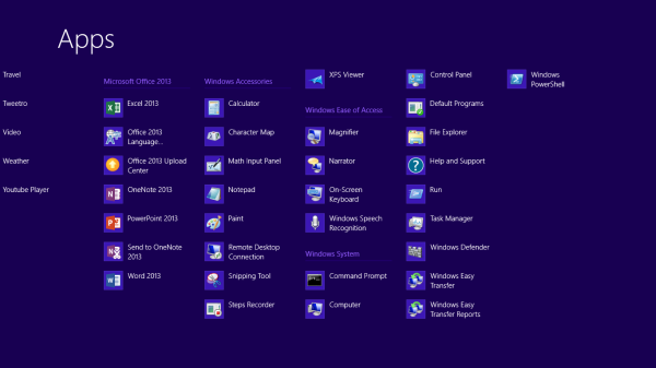
There’s also a list of desktop applications that’s a little less heartening. The familiar old Windows Accessories are still sticking around, with favorites like Paint and Notepad joined here by the classic Remote Desktop Connection application, Snipping Tool (another holdover from the Windows Tablet PC days), the Math Input Panel, and XPS document viewer. Ease of access applications, too, are desktop-based, as are system functions like Control Panel, Command Prompt, File Explorer, Task Manager, and the Run dialog. Personally, I’m disappointed that there wasn’t a Modern UI version of Command Prompt because, let’s face it, how cool would that be?
You’ll note that I left out the headlining Windows RT application: Office 2013. It’s one of the most vital pieces to the Windows RT puzzle, so it demands a bit more context - I’ll get to it in a bit, after running through some of the more notable first party applications.
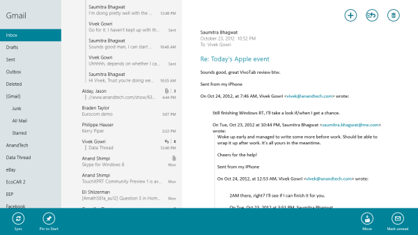
The mail application here is decent, with an ultra-spartan design and a straightforward 3-column layout. You get accounts and folders on the far right, a middle column with the sender, subject, and thread information. When you expand a multi-email thread, a message preview is also shown. Finally, in the main part of the window, the selected message is displayed. If you’ve used any recent version of Outlook or Hotmail, the layout and implementation should be instantly familiar except for the Metro visual style. Compose, reply, and delete are located in the top right corner of the email window, while mark as unread and move to folder are located in the bottom edge swipe bar.
As far as options go, there really isn't much to mess with - just the ability to turn off threaded messaging. You can connect any EAS, IMAP, or POP email accounts, with support for Hotmail, Gmail, Exchange, AOL, and Yahoo mail accounts built in already. For Gmail accounts, the delete button actually just archives things - to really delete mails, you need to move the message to the deleted folder.
Mail isn't Outlook, and usability is far from perfect. Manual syncing requires an edge gesture to reveal the sync button and there's no way to just tap on a sender's name and create a new email. There are other little issues like these that keep Mail from being a best in class tablet email client. Mail works, it just isn't great.
Calendar
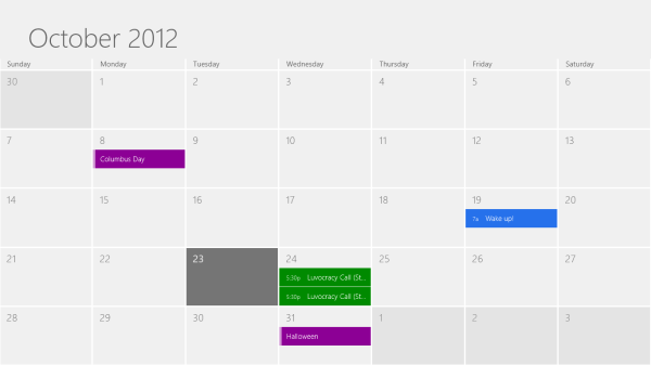
The calendar application is similarly focused - a very clean user interface with not too much power, but it does exactly what it needs to. It will sync to Hotmail, Google, and Outlook calendars, and I'm hoping that once there is a Facebook application, it will sync to that as well. You can pick between day, week, and monthly resolution from the bottom swipe menu, which is also where you add new calendar events. Options for adding new calendar events include date, time, length, location, repetition and reminders - the standard list. The UI is again very touch-centric, so trying to use the calendar with just the mouse is slightly frustrating since everything is hidden in the edge swipe bar. Thankfully, pressing or clicking on a particular day/time takes you directly to a new event creation page, which is pretty convenient. I like the way the calendar application operates, and the visual style is perfect for getting the information you need at a glance. Power users might find it lacking, but for basic tasks, it's more than adequate.
Messaging
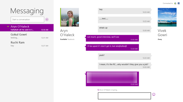
The messaging application is one that has so much potential, but needs more to really be useful unless you only use Live Messenger and Facebook Chat. Personally, given the Skype acquisition and the combining of the Windows and Skype IDs (I’ll get to this later, but basically when you login to Skype, your Windows ID is linked to your Skype ID), I feel like the Messaging app should either include Skype chat in it or somehow fuse Skype with the messaging protocols already in place. I personally rely on Google Talk, and in an ideal world it would be supported as well, but I won’t hold my breath.
Nobody I know has used Live Messenger since it stopped being MSN Messenger, so I reserved most of my testing for Facebook Chat. It’s a good looking chat interface, but using it full-screen is a total waste of display real-estate. Messenger is an application that lives for Windows 8 Snap, and it’s really the perfect app to show off that capability with. Finally, a tablet operating system that’s good for instant messaging.
Bing News, Sports, and Travel
There are a variety of Bing-based applications here - News, Sports, Travel, and of course, Bing itself. I personally don’t find too much point to the Bing search app, since if I’m already in the browser it’s much easier just to search from the URL bar.
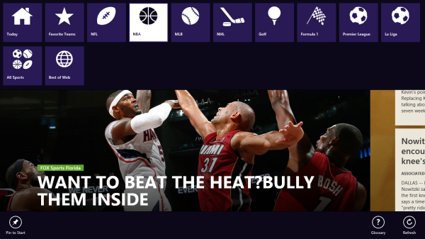
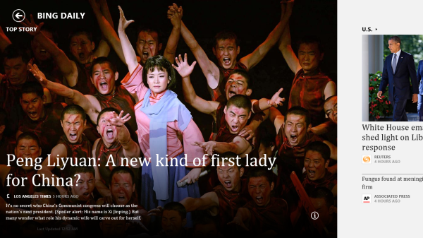
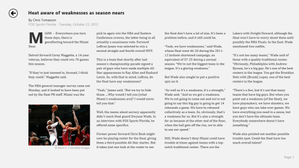
The other applications are somewhat interesting though. Sports and News are very similarly designed, so I’ll cover them together. Basically, there’s a top story that takes up most of the front page. You can horizontally scroll through a number of other headlines, aggregated from various news sources (Reuters, NYT, AP, etc) and separated by category - US, World, Technology, Business, etc. You can choose to browse the “Bing Daily” news, news specially targeted towards you, or pick from the list of sources to see each one individually. (My feed was full of technology news, wonder why.) Sports is essentially the same thing, except with the categories being sorted into the various sports. You can pick favorite teams, look at all the day’s sporting news or just the particular sport you want to see.
In either case, the articles are presented in a clean, easy to read format. For a one-stop-shop news source, it’s pretty decent. The overall treatment reminds me a bit of Flipboard a bit, while the articles themselves are displayed in a reading optimized context like Apple’s Reader mode in Safari. The treatment is obviously different - horizontal columns and page scrolling, but it’s a generally similar concept.
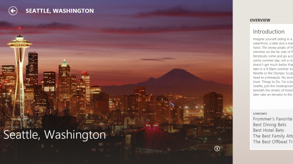
Bing Travel is a bit different - it has a list of popular destinations, and features numerous photos, maps, panoramas, list of attractions, hotels, restaurants, and guides for each city page. From the app, you can research the location, book flights and hotels, and use the application to guide your trip plan in terms of sites and restaurants to visit. Most big cities in each geographic region are listed, though smaller travel destinations are a bit harder to come by. I can see the app being really useful when on travel as a more convenient alternative to Yelp.
Xbox Live: Music, Video, and Gaming
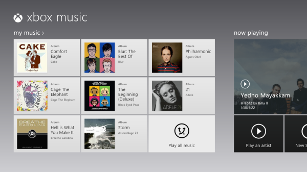
The music and video players are now part of the Xbox Live family of services, so they’re connected to Xbox Music and Xbox Video respectively. The applications are separate but are very similarly designed and laid out, with local content on the left, featured content in a central location, and content stores to the right. The bottom edge swipe brings up the ability to specify a file for playback, as well as a now-playing control bar. The music application looks quite good when snapped to the edge, with various album art from your library appearing as the background for the music controls.
Hilariously, videos can also be played back when snapped, albeit in a very small window. It’s not the best way to watch a video (who enjoys watching video content in a 320x180 window? Anyone? No takers?) but you can do it if you really want to. The video playback controls are pretty elegant in full-screen mode, and both players seem to have taken a number of interface design cues from the Zune software. I’m a huge fan of the Zune desktop software and how elegantly it operates, so I think this is great. I’m also just glad to not have to deal with Windows Media Player.
Both Xbox Music and Xbox Video look very similar to the latest Xbox dashboard update, and it’s clear that Microsoft is pushing a unified entertainment content front here. I remember when Microsoft was supporting a half dozen different music stores when the original Zune launched in 2006, so I’m just glad that they’re finally consolidating all of their services and concentrating on a single content store. Xbox has been their most successful entertainment effort to date, so it’s no surprise to see Microsoft put their faith in it for media as well.
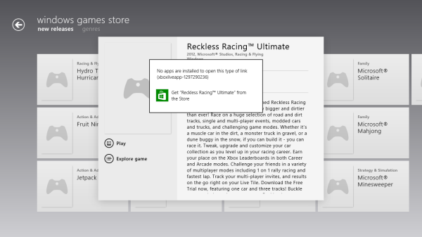
Now, we can’t discuss Xbox without touching on gaming. Xbox Live is obviously the gaming portal of choice for Windows RT, and offers various hubs for Windows and Xbox 360 games. The Xbox Live application didn’t appear to be ready at the time of posting, with broken links and missing pictures for all the games and hubs. This is still an unreleased software (until Friday, anyways) so it’s possible that we’ll see the application be updated between now and then for a working final release. We will also have to wait until then to see what game support will be like out of the box; currently, the Xbox Windows Game store shows titles like Reckless Racing, Hydro Thunder Hurricane, Fruit Ninja, Cut the Rope, and a number of Microsoft classic titles like Minesweeper and Solitaire, amongst others.
Camera and Photos
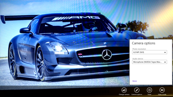
The camera application is about as basic as you can get, with a translucent control bar that lets you switch cameras, change between still and video capture modes, set up a timer, and basic picture quality settings. Basic isn’t necessarily a bad thing though, as the application operates smoothly and quickly, with near-instant switching between modes and cameras. The controls are very straightforward - tap and hold to lock exposure is supported, and to capture an image you can just tap anywhere on the screen. It’s one of the easiest capture mechanisms out there, and fits right in with the simple UI.
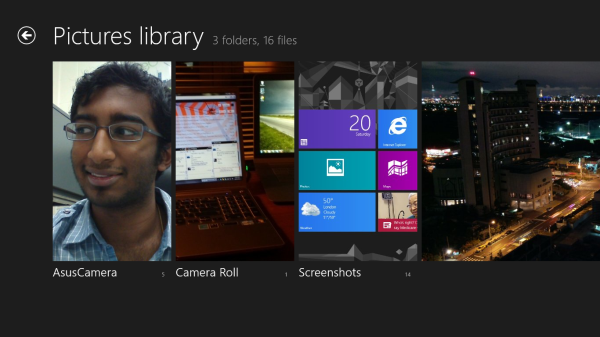
The photo application pulls images from your local pictures folder and camera roll, as well as being able to connect to Facebook, Flickr, and SkyDrive. They show up as panels for each service, which show a full list of thumbnails. It’s worth pointing out that you can only see photos uploaded to Facebook from your own account, not friend’s images or pictures you’ve been tagged in. As is now the norm with tablet picture galleries, you can view images in slideshow form or just flick through them individually. For local images, the bottom edge swipe brings up an option to delete the images, as well as setting as the lockscreen image and starting a slideshow. For images on Facebook, there’s an option to view them in Facebook, though you need to actually be signed into Facebook in IE for this to work.
The overall takeaway from the camera and gallery applications is that they’re designed as minimally as possible and do exactly what they’re supposed to with a minimum of fuss. You won’t see any spectacular functionality, though the ability to slideshow through Facebook galleries is a nice touch. I think we’ll see manufacturers offer their own spin on these applications, like ASUS and their separate camera application, in an attempt to gain minor levels of platform differentiation. Microsoft has kept a pretty tight reign on the customizations allowed for the Windows Phone platform though, so I can’t see them allowing anything too invasive on Windows RT devices either.
The Keyboard(s) - Handwriting Recognition Returns
Windows RT comes with three keyboards. The standard QWERTY keyboard looks and feels like a larger version of the Windows Phone 7 keyboard, with the same design aesthetic and similar pop-up options for punctuation. In Modern UI, it takes up the entire bottom half of the screen, but interestingly enough, in desktop mode it doesn’t quite stretch full screen - there’s roughly 20 pixels left on either side of the keyboard. You can choose to stretch it out such that it spans the width of the screen, which changes the key aspect ratio and makes the entire thing wider. It doesn’t change the usability at all, but it was an odd bit of discontinuity. The number page has a unique layout, with a number-pad on the right and commonly used punctuation and symbols on the left. Other than that though, it’s a pretty straightforward keyboard that does its job well.
The second keyboard is a split keyboard, but instead of being an overlay, it takes up the same amount of space as the regular QWERTY and adds a number pad right in the middle. The unorthodox layout is somewhat jarring at first, but if you want to type with your thumbs, this is the only way to do it. I honestly prefer the way Apple does it, with two separate key banks on either side of the screen (and actually, I think the first time I saw it like that was on the old Origami UMPCs back in the day) - it lets you see more of the display and ends up being more functional because of that.
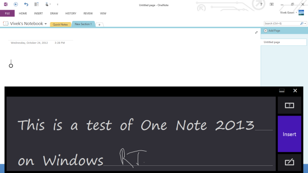
The last keyboard is actually probably the most interesting, because it’s not really a keyboard. It’s the return of our old friend, the handwriting input panel. This is one of the only places I can find any remaining trace of the tablet PC era. None of the devices we had to test were pen-enabled, so the only way to use it was using our finger as a capacitive input. I was actually shocked at how well it worked. I know quite a few people waiting on the Wacom-infused Windows 8 Pro slates, but for those on a budget, I can easily see the handwriting input being quite useful in conjunction with OneNote and a capacitive stylus.
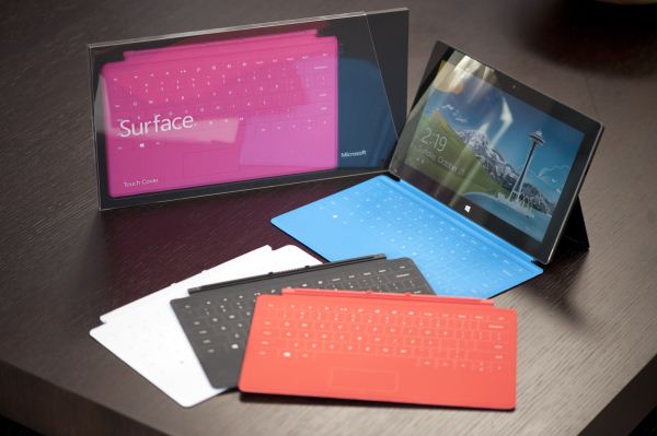
With Microsoft integrating a keyboard into the Surface covers, ASUS going so far as to bundle the laptop dock as a default feature with the VivoTab RT (they didn’t even want to talk pricing of the tablet individually), and almost everyone else offering at least the option of an add-on keyboard accessory, the virtual keyboard is a bit less critical here than it is on some other platforms. Beyond basic URL entry, I barely touched the virtual keyboard - for writing, email, messaging, or anything else, I just picked up the laptop dock. Given how much the physical typing experiences have been emphasized by the hardware manufacturers, it’s very plausible to think that the virtual keyboards could get relatively little use.
Internet Explorer 10
There are two distinct versions of Internet Explorer 10 - one that runs in the desktop and looks very similar to the IE9 and IE10 experiences that we’ve been used to on the Windows 7/Windows 8 desktop, and another that runs within the framework of Modern UI and looks like an upscaled version of IE9 Mobile from Windows Phone 7.5 Mango. Both use the same rendering engine and perform identically, so we’ll keep that in mind when looking at performance numbers. Other than the user interfaces, there’s relatively little difference between the two browsers, though you will need to open the desktop IE10 to change browser settings - there's no way to do so from within Modern UI.
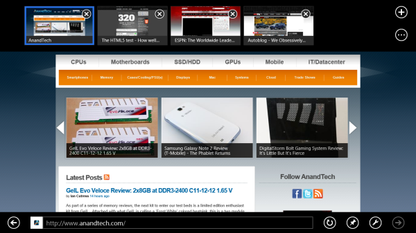
Gestures in the Modern UI version of IE are very important - swiping from the top or bottom brings up the URL bar at the bottom and the thumbnail list of open tabs at the top. It looks great, and keeps the webpage completely clean, but I don’t think the tabbed browsing implementation here is that great - I’d rather see something like Chrome or Safari with the list of open tabs always displayed at the top of the window. Changing tabs requires an extra step (swipe, then select), which isn’t ideal for changing between tabs quickly. If you deal with a lot of open tabs, or have some need to flip between two specific tabs repeatedly, this will get annoying relatively swiftly. It still looks great, and for touch-based browsing it works quite well other than the concerns over tabbed browsing. The “fancy” version of IE10, as Anand called it, strikes me as a very idealistic design philosophy that doesn’t necessarily work as well as a less elegant interface might.
One feature that works very well but could use some performance tuning is the back/forward touch navigation for Modern UI's IE10. To go back a page just swipe from left to right (or right to left to go forward). It's incredibly intuitive. My only complaint? Although going back immediately shows you the previous page, you have to wait for the page to actually re-render before it's usable (which on present day ARM hardware isn't exactly fast). I suspect this is something that will become far more useful over time with faster SoCs.
The desktop IE10 is just desktop IE, you’ve seen this before. Nothing that new, the UI looks pretty similar to IE9 (which is the first version of IE I can remember enjoying, though it will never replace Chrome in my heart) and it functions similarly as well. Obviously, there’s an updated rendering engine, but other than that and a new scrollbar design to match the rest of the Modern UI visual style, there’s not much to see here.
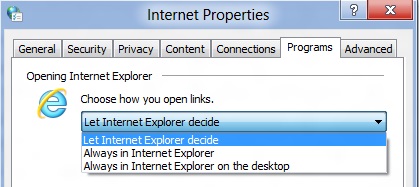
The most interesting part, actually, is in the settings - you can set links to default open in Fancy IE10, the desktop IE10, or let IE decide which to use on a contextual basis. You can also have the IE10 tile in Modern UI to open the desktop IE10, so you can basically ignore the new IE10 UI entirely should you want to do so. Now, I suspect this option exists primarily for desktop and notebook users of Windows 8, who don’t want to deal with using the Fancy IE10 interface with a mouse input. But it’s there for Windows RT users who want to use only the desktop IE10 UI. Personally, I wouldn’t want to use the classic interface in touchscreen devices - UI elements are damn small at this pixel density, making it more difficult to hit the right buttons than it needs to be. There’s a reason the Modern UI variant of IE10 exists.
Performance
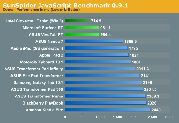
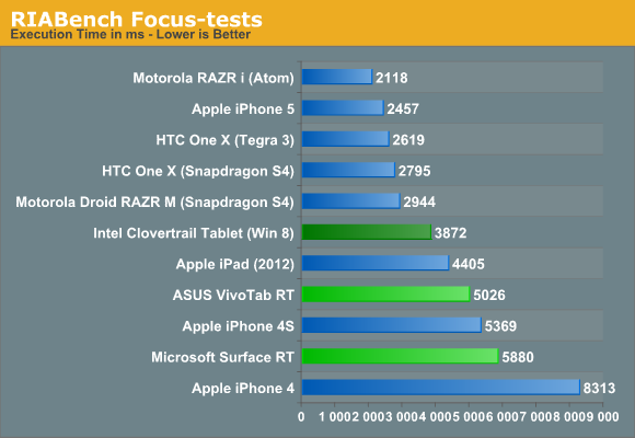
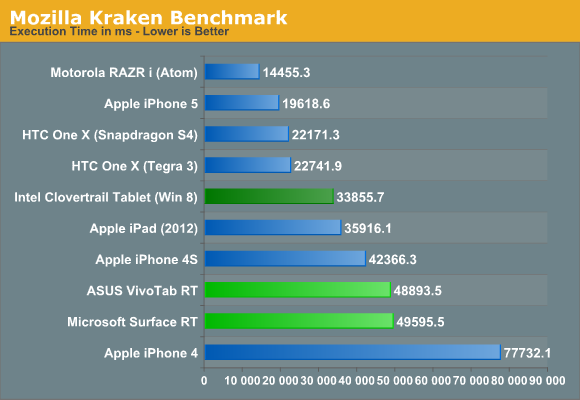
From a performance standpoint, we’ve just brought over the same three benchmarks that were used in the VivoTab RT and Surface RT reviews - SunSpider, RIABench, and Mozilla's Kraken. Honestly, I think SunSpider scores are becoming irrelevant - as one of our commenters said, the art of getting better SunSpider scores has started becoming a race to see who can cheat on the test most. Cheating in this case would be considered optimizing browsers for this specific test, and they’re not wrong. While IE10 has great, great SunSpider scores, it’s far behind in the other two JS benchmarks compared to similar hardware running on other platforms - look at the Surface or VivoTab RT compared to the international Tegra 3 version of the HTC One X. And I’m almost certain that if we had a Nexus 7 on hand to run those tests on, the differences would be larger still.
The HTML5 Test score 320 (plus 6 bonus points) is better than most tablet browsers from a year ago, but lags behind the latest mobile versions of Safari (386+9) and Chrome (390+11). Our Windows 8 Consumer Preview article showed that IE10 had made some pretty significant strides from IE9 (which was leaps and bounds better than 8, and then some) but JS performance is still behind the curve for now. The experience doesn’t suffer from that though - it’s still a very capable modern browser that won’t leave you disappointed.
Office 2013 for Windows RT
Office 2013 is the headlining application for Windows RT. And it’s a pretty big deal - this is the first time we’re seeing the full Office experience reach a modern tablet platform, at least in the first party sense. In the smartphone world, this wasn’t as much of a distinguishing factor as Microsoft hoped it would be when they included a mobile version of the full Office suite in Windows Phone 7, but that’s because there’s relatively little scope for document creation or editing on handhelds. In the tablet world though, it’s huge. For a tablet to truly be a viable replacement for a notebook, office productivity needed to be addressed.
So Microsoft decided to do something about it: Office 2013 Home and Student Edition ships as a pre-installed part of every single Windows RT tablet. And just like that, almost every non-engineering student I know could get away with a Windows RT tablet as their primary computing device, provided they aren’t gamers or aren’t attached to the idea of local storage. It’s something I couldn’t say about the iPad or any of the Android tablets out there. But I’m getting ahead of myself here. Let’s look at the applications themselves.
Office Home and Student contains Word, Excel, PowerPoint, and OneNote, so you get the core three productivity applications, as well as the one with the most potential for tablets. The one application that will probably be missed most is Outlook, but with Outlook account support for both the Mail and Calendar apps, enough of the functionality is still available. Outlook is more power-user oriented than either Mail or Calendar, but when it comes down to it, Windows RT was created to serve a more consumer-oriented market segment that typically doesn’t rely on the more intricate functionality of Outlook.
Design was always the biggest question about creating a mobile office suite. How much would Microsoft be willing to change the interface to suit a touchscreen input? How much functionality would that give up? How would Excel even work? I don’t actually have an answer, but here’s where the thinking went: why bother designing a touch-centric typing or spreadsheet app if most people are going to turn to a physical keyboard to use it anyways? And it’s a line of reasoning that makes sense - beyond going completely to voice control, I cannot see myself using any word processor without touching a physical keyboard. And many of the more complex functions of Excel, like formulas and macros, would be near impossible to replicate on a touch-centric UI without neutering a decent amount of the power and control users have.
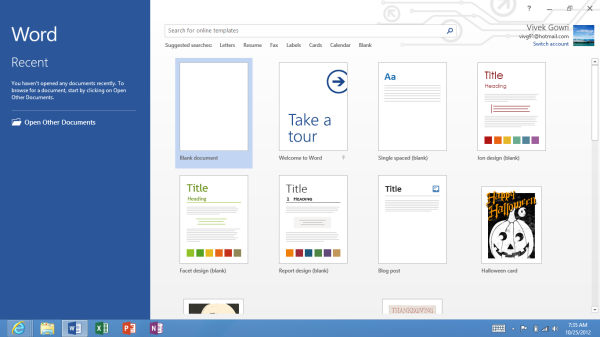
So, instead of redesigning Office to fit within the new Modern UI guidelines, Microsoft simply ported the x86 version of Office 2013 over to ARM and runs it as a desktop application. I can’t blame them - Office 2013 was redesigned with the Metro design language, so it already fit the Windows RT visual style, and it was just easier for them to not mess with the UI or UX further. But that’s actually a good thing - Office is the killer application for RT because it functions exactly the same as Office 2013 on any other system. If you live in the world of Office 2013 and SkyDrive, this is fantastic news because you need to make almost no adjustments to your workflow. It’s just as capable and powerful on here as it is on any other Windows system.
Office isn’t perfect, and you can level any number of complaints at it - aggravating at times, uses proprietary file formats, resource intensive, expensive, difficult to learn, and I’m only scratching the surface. Based on my usage of the Office 2013 Preview on Windows 7 and RT, it’s actually my favorite version yet, so there’s that, but the main point is that this is still a full-fledged version of Office that we’re talking about here. Over the last two decades, people have learned to put up with its quirks and faults, and it’s still one of the single most important pieces of productivity software on the market.
So, how does it all work? Pretty well, all things considered. All of these applications are pretty much exactly as you would find on an x86 PC, so I’m not going to go very far into the design and functionality, though there are a couple of interesting use-cases that I’ll bring up later on. The most critical concern I had going into Office on ARM was performance - the reputation for being a resource-intensive software suite is not undeserved, let’s put it that way, and quad-core A9, great as it is, doesn’t have the raw compute horsepower of Atom much less Core 2 or any newer Intel processor.
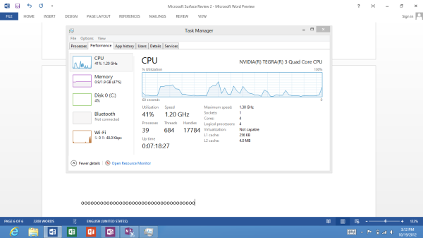
In Word, it’s relatively easy to pull 30% CPU utilization when typing quickly. Anand saw up to 40% on Surface, and I managed to get CPU utilization all the way up to 55% when pressing random keys as quickly as possible. Compare this to Notepad, which usually hovers in the 5-10% CPU utilization range, and it’s clear to see how heavy a load Office puts on the system. Even with the high CPU utilization though, I never saw any lag in the characters appearing, so it’s mostly an interesting point to note and not an issue with the typing experience.
Update: Microsoft shared an official response with us about the high CPU utilization we're seeing:
Increases in CPU utilization while typing are an expected behavior in Word, but should not extend beyond the immediate typing. However, we are always looking at ways to improve CPU utilization and the customer experience with Office.
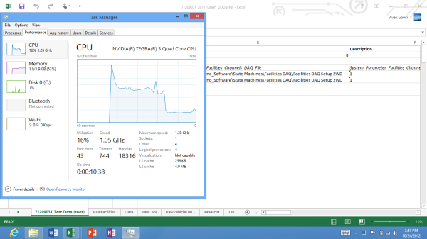
To really push the system, I loaded up some of the Excel files I work with at my real life job as an automotive technology researcher. These are raw and mostly unprocessed dynamometer data test files, with roughly 3 million data cells each (give or take.) The largest had just under 4 million data cells and was 39MB in size, smallest about 1.8 million and 19MB in size. A couple of graphs and some equations. Together, the four files totaled 112MB. I decided to open all four at once - it took about a minute and a half, with a max CPU load of 72%. It was crazy, but once everything was loaded, performance was actually decent. I wouldn’t want to necessarily work on the files for extended periods with a system like this - the screen is too small, and the couple of bits of lag would drive me nuts (plus, without Matlab, it’s a bit pointless) but for quick graphing of basic data, it works significantly better than expected.
The good thing is that there’s a lot of RAM here - with 2GB seeming to be the default for Windows RT tablets you’re rarely memory starved. So even with 250MB worth of RAM dedicated to Excel, CPU headroom is still the main limiting factor. For more basic Excel tasks, like the chemistry labs that were commonly assigned in undergrad, there’s definitely more than enough power here. The files I loaded up are typically only manipulated on quad-core workstation notebooks and are far and away an extreme use case.
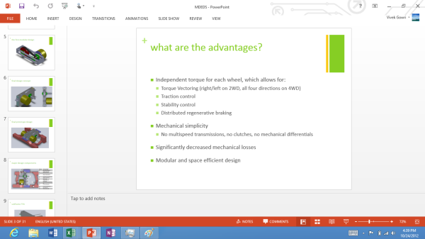
I didn’t really spend a whole lot of time in PowerPoint, because I typically don’t use it very much. I loaded up a presentation I gave late last year about some of my research at the time, and started editing it to see if the experience had anything different to mention. Performance seemed good enough, with maybe a hint of frame drop when scrolling through the slide thumbnails on the right edge (it moves at something closer to 25 FPS than 30). I liked the ability to swipe back and forth between slides when in Presentation mode, that’s one nice thing about the tablet interface. Other than that, this is just PowerPoint on a smaller screen.
OneNote is the one that I was really interested in. Because even though it runs within the framework of the Windows desktop, it’s an application that really lends itself to tablet usage. Back in the tablet PC days, OneNote was the killer usecase, the one program that really lent itself to being used in conjunction with pen-input. I came very close to buying a Wacom-enabled tablet on numerous occasions for the specific purpose of taking electronic lecture notes with OneNote. (It never happened, and I ended up taking very few notes of any kind through college, but such is life.)
Now, without active digitizer support on most Windows RT tablets (I haven’t seen any with active digitizers), you’re limited to either keyboard or capacitive touch input. This is where the handwriting panel comes in, and like I mentioned before, it’s quite good even when you’re just using your finger to write. With a capacitive stylus (which I regrettably do not have on hand) I can see this being legitimately useful to take handwritten notes on. It’s good enough that you can get away without a Wacom-enabled tablet if you don’t want to shell out the extra $400 or so. I genuinely wish something like this was available when I was still in the notetaking phase of college, many moons ago - the fifteen year old me would have killed to have a $600 tablet with solid handwriting recognition, even without an active digitizer.
And that’s really what makes Office for Windows RT interesting. It gives you 95% of the office suite experience and capability of any normal desktop or notebook PC in the modern tablet form factor, introducing some much needed productivity into what was previously a very content-consumption oriented device category.
Skype for Windows RT: The New Messenger?
I decided to give Skype its own page, because it’s kind of a hybrid first-party/third-party app and I think it’s going to be very important to Microsoft going forward. It’s not pre-installed so you need to install it from the Windows Store, but Microsoft’s ownership of Skype means that the service is very well integrated to the Windows 8/RT platform.
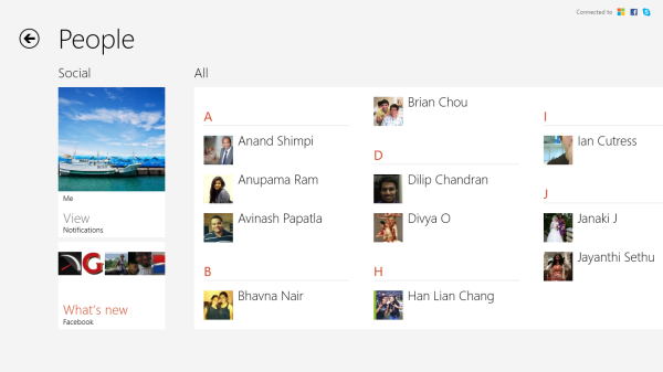
The new version of Skype runs within Modern UI and has been redesigned from the ground up, with some critical changes being made to the Skype platform. You can login now with any form of Microsoft account, including Skype, and your Skype ID will be linked to your Windows ID. Your Skype contacts can be found either from within Skype or from the People application, so you can just call people directly out of the People application where the rest of your contacts are.
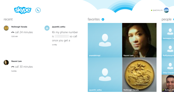
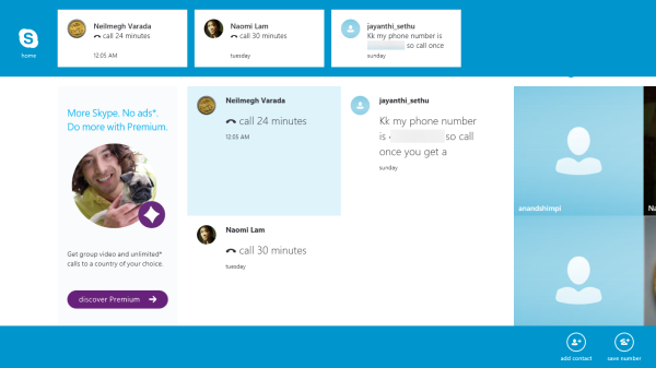
Skype’s new UI is clean and relatable, for the first time in quite a few revisions. Metro has more than done its job here, taking what has become a clunky and archaic interface over the years and really turning it into a modern, streamlined application. There are four areas, showing recent calls and conversations, favorited contacts, and a list of all your contacts as distinct panes. The fourth area, actually the first one you see, is an advertising column for Skype Premium with the sell being “More Skype. No ads.” How tempting. If you’re a free Skype user, like almost everyone I know, it’s just something you ignore but it really does bug me, because it mars what is an otherwise great looking app.
The edge swipe context bar brings up options to add contacts and numbers at the bottom, as well as thumbnails of recent contact history at the top. Once you enter into a contact, you’re free to chat with them, call them over voice or video, or add participants for a group chat. Overall, it’s well organized and very straightforward to use.
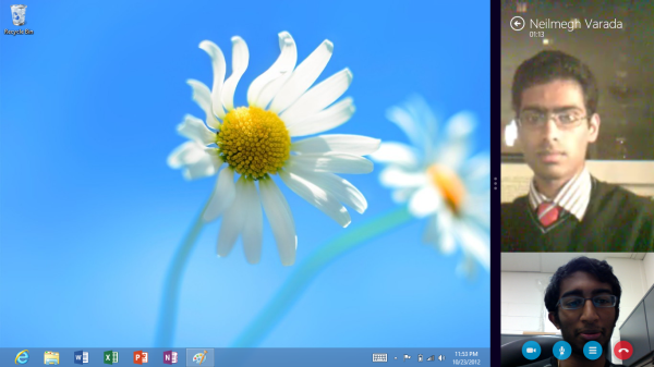
The cool part is that you can snap video chats to the edge of the screen, giving you a slice of the chat window. This is actually a really awesome way of doing things, since as long as the other person is generally in the middle of their webcam field of view, the 320 pixel width is actually more than adequate to carry on a good Skype conversation. I’m a big fan of using snapped applications for multitasking, and I think Skype’s implementation of it is very sleek. For the first time in a while, I’m very pleased by the design and responsiveness of Skype.
Eventually I think MSN/Live Messenger will be folded into Skype, paving the way for Skype to become the default messaging client for the Windows platform. The first step in this was combining the Skype ID with the overall Windows ID, and in time we will see how important this was for Microsoft to get right.
Windows Store and the 3rd Party App Situation
So the third party app situation, out of the gate, is the biggest issue I can see with Windows RT. Obviously, with ARM processors, typical x86 legacy programs are out, so you’re forced to rely exclusively on the Windows Store for third-party applications. Within the Windows Store itself, almost all of the applications are compatible with both x86 and ARM architectures - Microsoft claims around 90% off the apps on the Windows Store at launch are compatible with both Windows 8 and Windows RT, and it appears that a lot of developers will be releasing applications on the Store for both platforms simultaneously.
The problem is that currently, there aren’t that many apps, and of them, not many are very good. Obviously, we’re still a couple of days from launch and I’m expecting a significant uptick in the number of quality apps on the 26th particularly, but also over the coming weeks and months. As the new versions of Windows gain market share, the Store will grow and mature.
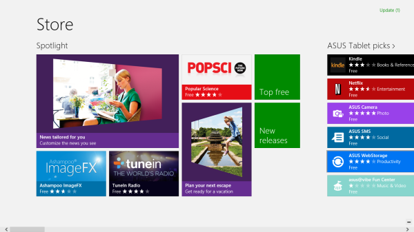
Let’s talk about the Store itself. It’s a bit of a mixed bag. Yes, the Metro visual style looks great here, as it does almost everywhere else. Metro just lends itself well to anything involving lots of rectangular pictures (or app icons, in this case). Unfortunately, the Store is a bit poorly organized, and it’s difficult to find really relevant applications. The “Top Free” list needs a “Top Paid” companion, and there absolutely needs to be a “Sort by most reviews” option. Those two things would make it significantly easier to find the high-volume, headlining applications in any given category. I also really, really want the option to see all applications made by a specific developer (like, say, Microsoft.) The inability to do so is a pretty significant oversight from where I stand. These are all pretty simple fixes, just a few extra organizational options that would go a long way to making the store easier to navigate.
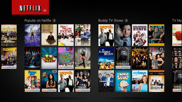
For right now, the best apps I can recommend on the Store are staples like Kindle, Netflix, Evernote, and Wikipedia, along with news and shopping apps from USA Today, NBC News, eBay, Newegg, and Popular Science. Other notable applications include IM+ and a number of internet radio apps like iHeartRadio, TuneIn Radio, and Slacker. In addition to those and a number of applications and games from Microsoft and Microsoft Studios - Xbox SmartGlass, Fresh Paint (a new paint application), OneNote MX (the Metro redesign of OneNote, still a preview), the Modern UI version of Remote Desktop, Reckless Racing, Hydro Thunder, etc - there’s not much out there, except maybe Fruit Ninja.
There’s still a lot of 3rd party stand-ins for applications that will get first party support, like a BBC News application actually developed by BBC and things like that. These independent apps can sometimes be good, but are almost always outdone by the first party ones. It’s just a matter of design and quality. I know that ESPN is slowly but surely bringing out their suite of applications - their cricket and football (soccer) apps were both released recently, which indicates that Scorecenter and their other applications for online radio and live video will all hit the store in the near future, but they’re just one developer. I just don’t know how much time it will take for a majority of those applications to be released. Skype isn’t currently available in the store, but will be on the 26th, which makes me wonder how many new applications will hit Windows Store in time to coincide with the official launch date of Windows 8. I want to revisit this a week from now, or even just two days from now, to see where things stand.
I’ve seen a lot of early reviews of Windows RT-based tablets decry the app situation, but I’m assuming the growth will occur significantly more quickly than it has for, say, Windows Phone, for one simple reason: this is still Windows. A very different kind of Windows, yes, but it’s not like people will stop buying Windows computers. Windows Phone has had issues gaining marketshare over the last two years, but starting tomorrow, 85% (or more) of computers being sold worldwide will be running either Windows 8 or Windows RT. There are too many people out there with new Windows systems for developers to somehow just stop releasing Windows applications.
It's important to remember that devs aren’t creating apps for Windows RT specifically, they’re creating new applications for the new Windows UI, which just happens to cover two very different hardware platforms. Nobody worries about the state of Windows 8 applications because all of the legacy desktop apps will still work, but the Windows Store will develop and mature at the same pace regardless of whether you’re looking at Windows 8 or Windows RT. Everyone worrying about Windows RT tablets and third party apps should have the same concerns about touch-centric apps for Windows 8 tablets.
But regardless, we’re still missing some huge applications at this point: Facebook, Twitter (though Rowi makes for a good stand-in), Dropbox, Pandora, Yelp, any kind of Google service, anything from Adobe, and generally useful but not necessarily headlining financial and bank-specific apps. Check back with us in a few days, because I don’t think the Windows Store will stay as sparsely populated as it is currently, but until that changes, there will be questions.
UI Performance, Storage, and USB Compatibility
by Vivek Gowri and Anand Shimpi
With Windows Phone 7, Microsoft did a great job of taking generation-old hardware and delivering a great user experience in spite of any silicon-level deficiencies. So naturally, with the new Windows UI, we were expecting a very smooth UI regardless of the underlying hardware. And they’ve most certainly delivered on that.
Animation frame rates are consistently good all the way through the UI, easily delivering what appears to be 60 fps for UI transitions. When pushed, Modern UI seems more likely to completely drop animations versus dropping frames, which eliminates the choppy experience you sometimes find in Android. It isn’t a common occurrence, the experience is generally very fluid. This kind of consistently smooth UI is what Google has been striving for in every recent release of Android, dedicating the release of 4.1 to eliminate the dropping of frames in even basic interactions. Scrolling, swiping, snapping, app switching - it doesn’t really matter what you’re doing, RT is just really smooth. Combined with the fluidity of the gestures, the entire system just feels like liquid, there are just no real slowdowns even running on a no-longer impressive SoC like Tegra 3.
| Application Launch Time Comparison | |||||||
| Boot | Web Browser | Maps | Games Center / Xbox | ||||
| Apple iPad (3rd gen) | 32.0s | 1.0s | 2.4s | 1.1s | 1.9s | ||
| Microsoft Surface | 27.7s | 2.6s | 7.1s | 5.0s | 5.0s | ||
But there is one area that RT struggles in, and it’s something that was an issue in Windows Phone 7 too - application launch times. Anand included this table in his Surface review, and it shows that boot performance is decent, but the 3rd generation iPad just kills it in application loading. The new A6X-infused 4th gen iPad probably widens that gap too, so it’s a pretty stark difference. It’s something that Microsoft needs to really focus on when updating the OS, because it’s easily one of the most glaring flaws in an otherwise stellar interface.
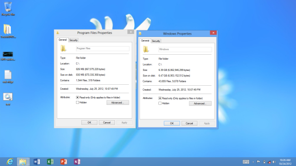
From a storage standpoint, the OS takes up between 6.5 and 7.5GB of space (Anand measured 6.47GB on Surface, I measured 7.35GB on the VivoTab RT) and Office takes up another 750-850MB (830MB for Surface, 749MB for the ASUS), so you’re looking at 7.5-8GB of NAND dedicated to the OS. On my 32GB VivoTab RT, I had 25.3GB of storage to start with, so after Windows and Office, I was looking at 17GB left over for programs and documents. That’s....not a lot - a bit of music, a decent selection of applications, a couple of videos, and pretty soon I’m looking at less than 10GB of storage left over. Thankfully, we’re seeing microSD slots on a lot of the more prominent Windows RT slates, so if you run out of room, you could theoretically toss in a 32GB or 64GB microSDXC card. Depending on how much data you plan on storing, I think you can get away with the lesser internal NAND and some microSD cards.
It’s also pretty clear that there will not be a Windows RT slate shipped with less than 32GB of onboard NAND. If you’re holding out for a cheaper Windows RT device with less storage, like a 16GB tablet for $399, there’s almost no way that happens - it’s implausible to think that anyone would ship a tablet with less than 5GB of space left for data storage.
Another key detail in Windows RT is wide-ranging USB peripheral support. USB ports have been a common feature on 10” Android tablets, but device support was typically limited to flash drives and basic input devices. The goal with Windows RT was to bring the traditional Windows experience to tablets, so USB driver support is pretty important. It’s not as easy as on an x86 system, where most USB peripherals would just work, but even with more limited Windows-on-ARM drivers, it’s pretty decent overall.
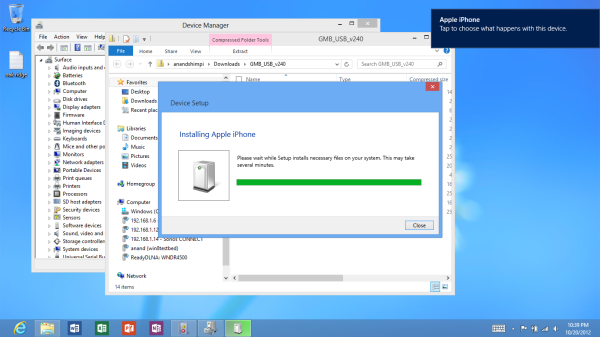
USB drives obviously work as you’d expect them to. Even SATA to USB adapters worked fine when plugged into Surface. Other smartphones and tablets also worked, although their level of support varied. For example, you can plug in the iPhone 5 and have it come up as a supported device for moving pictures to/from. However USB tethering is not supported by the class driver included in Windows RT. You can even plug an iPad into Surface and get the same level of support. The few Android phones I tried to connect in MTP all worked as expected, though transfer rates off my Optimus 4X HD seemed on the slow side, likely a function of the phone’s internal eMMC.
Printer support is pretty decent, although the Epson Workforce 910 Anand tried didn’t actually have specific driver support under RT. Although development for the desktop side of Windows is limited, manufacturers can supply Windows RT drivers to enable support for some more obscure devices. Unfortunately when it comes to those devices you’ll have to play the waiting game as there’s simply not a lot of third party Windows RT drivers available for download today.
Final Words
So, ten thousand words later, what can we take away from Windows RT? It’s definitely another superb user experience design from Microsoft. Say what you will about Windows Phone 7, but damn if that UI isn’t gorgeous. The Metro design language translates over to the tablet form factor really well, resulting in the Windows Modern UI. We’ve obviously known how Modern UI looks and feels through the various Windows 8 preview builds, but Windows RT ends up being more focused and offering a more consistent experience. It’s a side effect of being limited to apps from the Windows Store - because you spend a significant majority of your time in the new Windows UI, desktop use is minimized. In Windows RT, the Windows Desktop serves the purpose of being the more capable and powerful layer underneath the main portion of the UI, as opposed to Windows 8, which sometimes feels like the new Windows UI existing as an impractical interface layer on top of the traditional desktop.
The dichotomy just feels more comfortable in Windows RT than I feel like it has been in the previous Windows 8 systems that I’ve dealt with. It’s nice. This is the first time I feel like I’ve really connected with the new Windows UI, it makes a ton of sense to me now. I still think for mouse-based navigation, you’re better off treating it as a glorified Start menu, but it’ll be interesting to see how legacy programs affect the use of Modern UI in x86-based Windows 8 tablets as the Windows Store matures.
If you’re really concerned about the state of third-party apps, you just have to wait and see. I’ve seen a lot of snap judgements made about Windows RT in the last couple of days based on the dearth of good applications in Windows Store, and while I agree with that sentiment, I feel like it’s extremely shortsighted to write off the ecosystem already. Neither version of the OS has gone on sale yet, and we know that there are a number of applications that will go live on the official release date, as well as many more coming in the weeks ahead.
This isn’t like Windows Phone, where we need to see whether the platform will get any market traction before predicting the growth of the app marketplace. You can basically assume that the marketplace will expand significantly unless somehow everyone stops buying Windows-based systems on October 26th. The odds of that situation arising seem relatively low, so my bet is that the strength of the ecosystem will be a non-issue a month from now.
The default inclusion of Office 2013 and the emphasis on physical keyboards makes Windows RT the first tablet platform to significantly address the question of productivity. Combined with the equally advanced task switching and multitasking built into the UI, and this becomes the first legitimately useful tablet operating system out there. The Galaxy Note 10.1 wasn’t bad, but it was a single device that built additional functionality into a custom Android skin. Every single Windows RT slate comes out of the box with Office and the ability to have multiple active application windows. It’s just a few steps ahead of competing tablet platforms at this point.
And it’s not like RT loses out on a content consumption front. It’s paired with what is a very strong entertainment store and gaming franchise in Xbox Live, and the browsing experience is definitely competitive. It’s also a competent e-reader, with Amazon’s Kindle being one of the headlining apps currently in Windows Store. It even matches the power efficiency of the other ARM-based tablets, with competitive battery life and standby time. Obviously, ARM is the driving factor in the low power consumption, but it’s good to see that Windows is on a similar level as iOS and Android.
So this is a tablet platform that can do a good job of replacing both an iPad and an ultraportable in a number of different workflows. You get the best of both worlds, in some sense - Windows RT tablets have similar form factors to the iPad and leading Android tablets, and offer near-equal battery life, performance, and user experience, but they also give you the added benefit of strong productivity applications and the power of Windows Desktop. From a conceptual standpoint, almost anything you can do with an iPad can be done equally well (or close) on a Windows RT tablet, but the desktop-caliber office suite and versatile multitasking interface of Windows RT are impossible experiences to replicate on the iPad. It's not a perfect operating system by any means, but it brings a new dimension to the tablet space. So if you’re looking for a new tablet this fall, Windows RT deserves your consideration.

_575px.png)
